Friday, December 08, 2006

Convertible CD Cover

http://www.commarts.com/CA/interactive/cai04/
Package design, 2004
Sagmeister, Inc. (New York, New York)
(2005) 365: AIGA Year in Design 26

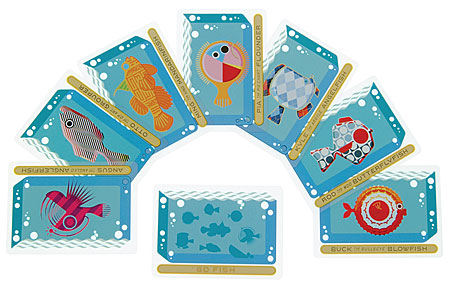
This cover is for an album by the Austrian analog/digital musician Hans Platzgummer. I love the way the designers used the inherent shape of a CD-Case to create a whimsical iconography. A minimum amount of circles is employed to create the illusion of an imaginary underwater creature; the use of primary colors enhances the simplicity of the geometric shapes.

Insects and Spiders, Oh My!

http://designarchives.aiga.org/
Illustration, 1999
U.S. Postal Service
(2000) 365: AIGA Year in Design 21

Commisioned by the US Postal Service, these series of 20 stamps are not only beautifully illustrated, but intelligently executed as well. By using artfully placed shadows and arranging the images so that they overlapped the adjoining stamps, the creepers seem to be crawling on the paper. The vibrant colors add to the sense of motion, so that the stamps are visually appealing both as a grid and as individual compositions.

Color in Motion CD-ROM

http://www.commarts.com/CA/interactive/cai04/
Interactive Annual 10: Color in Motion

In order to appreciate this MFA thesis on color, please visit the slide show posted on the Interactive Annual Website (2004). This innovative and interactive CD_ROM uses universal icons, playful animation, and fun music to illustrate properties of color and how they relate to the natural world. The designer broaches a complex subject in a clear, entertaining manner.

Chicago Chocolate Co.


http://www.commarts.com/ca/exhibit/103006/
Chicago Chocolate Co. in-store posters
Frank Dattalo, art director/designer/illustrator
Mike Roe, writer
Frank Dattalo/Mike Roe, creative directors
Marty Orzio, executive creative director
Communcation Arts Archive

Chicago agency Energy BBDO took inspiration in scientific studies that have linked women's need for chocloate with physiological causes. This humorous parody of medical illustrations
depict the reaction of a female brain when a piece of chocolate is being eaten. Great '50s-type illustration enhances the mood, as it alludes to the era's educational videos.

Alphabets Packaging


http://designarchives.aiga.org/
(2000) 365: AIGA Year in Design 21
Package Design, 1999
Lisa Billard Design (New York, New York)

Billing themselves as a “modern general store,” Alphabets houses a diverse collection of toys, books and ephemera. Playing off of Alphabets’ name, an illustrative style reminiscent of children’s “learn­to­read” flash cards represents the store’s vast range of products and its whimsical attitude. Keeping in mind the low cost of many items sold in the store, all packaging needed to be relatively inexpensive. Artwork was created that would not only not suffer by inexpensive reproduction, but would be enhanced by it.

I am Charlotte Simmons

http://designarchives.aiga.org/
(2006) 365: AIGA Year in Design 27
Book Design, 2005

This beautifully designed book echoes the innocence, strength, and beauty of Tom Wolfe's heroin. The filigree design in the background is an apt contrast to the simplicity of the curvilinear figure and sans sarif typography depicted in the foreground.

ABC


http://designarchives.aiga.org/
(2006) 365: AIGA Year in Design 27
Book Design, 2005

Hurricane Poster Project


http://designarchives.aiga.org/
(2006) 365: AIGA Year in Design 27
Promotional design and advertising, 2005
Laurie DeMartino Design Co. (Minneapolis, Minnesota)

Nestea Ice Tea Website


http://www.commarts.com/CA/interactive/cai06/
Interactive Annual 12: Nestea Ice (Winner Advertising Category)

The Nestea ICE microsite combines extremely detailed illustration with quirky viral video content, all unified by a Monty Pythonesque style of animation and sound. The attention to detail in all aspects of the project, from sound design to interactivity, seems as though it probably reflects both the fun and passion the developers must have had for the project. The more you watch, the more you're immersed.

Hifana Wamono Music Video


Comment
http://www.youtube.com/watch?v=aWHbORS_7iE
designarchives.aiga.org
(2006) 365:AIGA Year in Design 27 (56/179)

Please follow above link to fully appreciate this a celebration of Nippon culture and identity. Wamono is a music video that explores Japanese music, folklore, identity, art and technology, reinterpreting them as a contemporary hybrid expression of Japanese history. Originally made as a promotional video for the music of HIFANA (a Japanese music company), the video utilizes an ukiyo-e like style, but with unconventional and strange characters. This unusually unique pictorial world ends with a party inside a huge fish's stomach, what more could anybody want?.

Little Monsters


http://designarchives.aiga.org
(2006) 365: AIGA Year in Design. 27 (46/179)

Mocking Birdies


http://designarchives.aiga.org
(2006) 365: AIGA Year in Design. 27 (128/179)
Book Design, 2005

This deceptively simple children’s book, depicts a blue and a red bird imitating each other’s actions and “speech.” The lines are also staggered, so the colors and layout work in harmony with its jazzy meter. Eventually, the two birds join up, chirping purple lyrics, until a purple bird joins them as their songs spread this way and that across the page. Even the wires where they perch become bars of music. Annette Simon’s minimalist style makes the most of a few simple shapes and primary colors surrounded by ample white space. The way the figures appear on the page is echo the book's musicality, with their own visual rhythm.

Dry Soda Bottles


http://designarchives.aiga.org
(2006) 365: AIGA Year in Design. 27 (42/179)

Mad Science


Mad Science in the Imperial City
http://designarchives.aiga.org
(2006) 365: AIGA Year in Design. 27 (123/179)
Book Design, 2005

This is an extraordinary design for an engaging book. Mad Science in Imperial City, by Shanxing Wang, relates the experience of someone who left China after the Tiananmen Square massacre to settle in the U.S. The book is divided into four linked sections of poetic prose that draw both from the lyric and novel tradition; it utilizes scientific diagrams, mathematical equations, lists, and even a menu from an imagined Poetry Auction. All of this is integrated seamlessly by the designers, as can be seen in the jacket depicted above.

Creepcakes


Wednesday, October 04, 2006

Havainas


Here's an amazing flash-based website from Brazil. It was one of the Communication Arts' Interactive Annual winners in the advertising category. The address is www.havaianas.com.br/#

The flash animation is beautiful and inspired by a "neo-1960s-Ipanema-trippy-groovy" look. Each sandal is allocated a remixed version of one theme and six versions of the site exist in three different languages. The company manages to make its extensive catalogue fresh and interesting by creating a unique visual world that permeates the entire site. Even though each page has its own unique imagery, the site remains unified through style and the degree of saturation of its color palette.

Thursday, September 28, 2006

Cronan Designs


This week I'm posting this magazine cover for Cronan Designs. I love the way this designer used color. I'm still trying to analyze the color scheme.. It doesn't seem to conform to any of the color schemes I learned about in Art 121!

Wednesday, September 20, 2006

Guy's Guide to Giving Gifts


The cover to A Guy's Guide to Giving Gifts, also designed by Dianne Gibson and featured in Graphis Design Annual 2005, uses humour to illustrate the book's content. The chord with which the book seems to be wrapped alludes to a particularly unwise choice of present for Valentines or Christmas, as does the fact that the cover mimics a brown paper package wrapping stamped with the words "Return to Sender." The credits are written on masking tape at the edgges of the book and the designer plays with our expectations of depth as we cannot tell whether the chord is two or three dimensional. An analogous color scheme of red, pink, and orange is used; while a hand-made font in the title card adds humour and whimsy to the piece.

Wednesday, September 13, 2006

The Skin Game


I found this design in Graphis International, 2005. Designed for American Airlines magazine, this image accompanied an explanation of what different plastic surgery techniques accomplish and how they work. The designer, Dianne Gibson, plays with our expectations by interposing a black and white face on top of a colored one. Illusion of depth is created by the illusion of peeled back paper on the forehead, left eye, and right half of the lips. By seeming to escape the format, the "peeled back" areas seem to project into the viewer's space. The rectangles that reveal the younger-looking colored face provide unity of shape and color. In spite of the symmetrical nature of the faces, the design is asymmetrically balanced. The two smaller horizontal rectangles on the top half of the composition are grounded by a heavier, vertical rectangle at the bottom that extends to the edge of the format. Color is balanced by the fact that the eye on the left, a strong focal point, is counteracted by two larger areas of color on the right.

Wednesday, September 06, 2006

Kikkerland Classic Card Games


This week I am posting a design from the AIGA design archive webpage.This redesign of the classic card games Old Maid, Go Fish, and Crazy Eights for Kikkerland by Adam & Gabrielle Lewin is included in the package design category of (2005) 365:AIGA Year in Design 26. The design parameters required that the Lewins develop designs that would entertain both children and their parents while working around the added challenge of printing on clear plastic cards. They succeeded on all fronts by utilizing: bright colors in complementary or near complementary schemes and whimsical shapes to appeal to children; multilayered wit and sophisticated, highly detailed, intelligent design to appeal to the parents; and, finally, they took advantage of their medium by creating clear "peepholes" to create depth and optical illusion.

The packaging of these clear plastic card games are at once unique, visually stimulating, aesthetically pleasing, and durable. I would buy them in a hearbeat and I don't even like cards!

Sunday, August 27, 2006

Bean Counter


I'd like to start my first blog entry with this simple, yet brilliantly executed letterhead for Vicky Freeman, Accountant (Graphis Design Annual 2005, p143). Produced by Watts Design, the logo plays on the term "bean counter" in a way that introduces whimsy and creativity to a profession that is usually associated with boredom. On the right hand corner of the page, humorously alluding to creative accountancy, we find images indicating that one bean plus another bean equals three beans. The next grouping is found slightly below; in bold, gray sans serif letters is written the name of the accountant followed on the line below by the italicized words "bean counter' printed in the same brown as the beans. The final grouping provides contact information in the same gray color as the name. The color scheme acts a unifying element in the composition of the design. The mathematical symbols are executed in the same gray as the contact information and name, which in turn are written in a simple, no-nonsense sans-serif font (after all Vicky Freeman is an accountant). The brown of the of the beans is echoed by the brown of the phrase "bean counter." This not only adds contrast, but helps emphasize the concept in a subtle manner. Finally, the whole effect is repeated on the envelope and business card, in this way creating a complete brand identity.