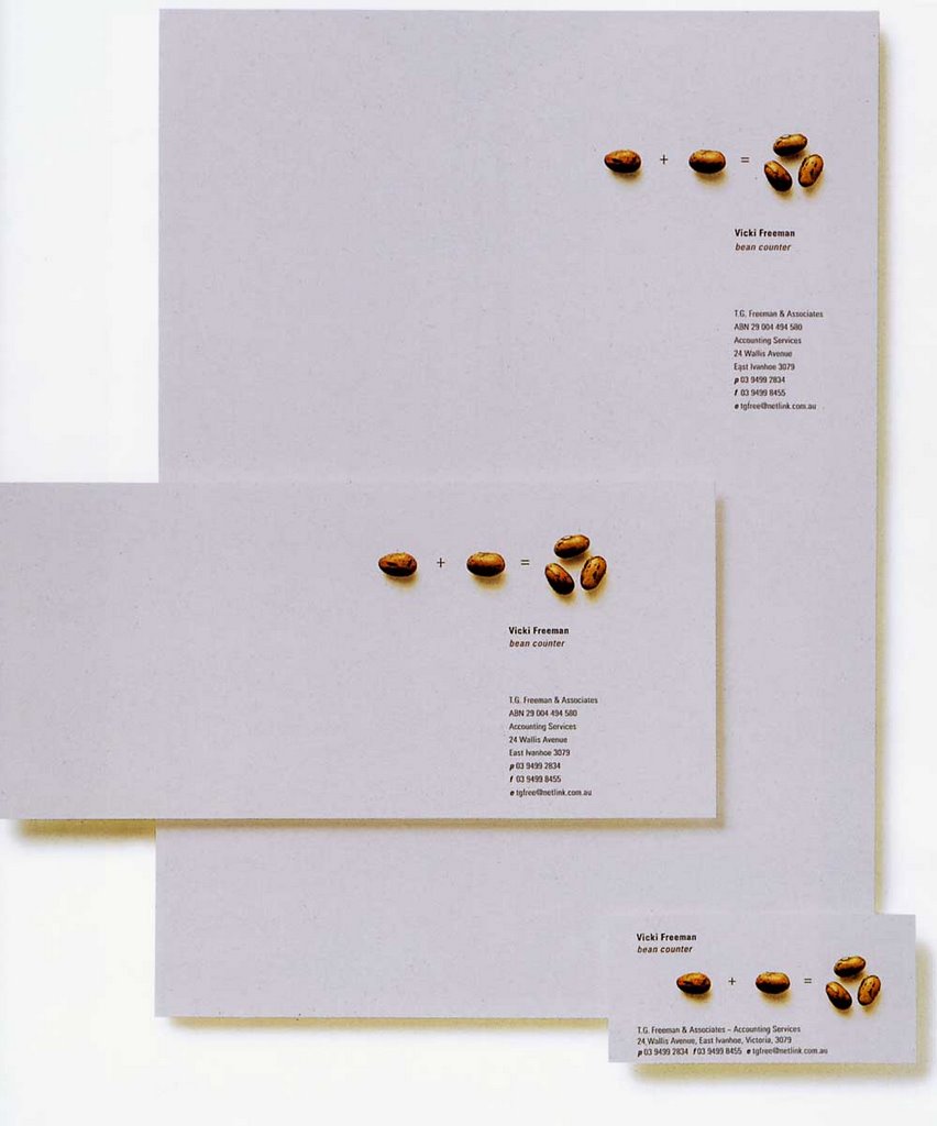
I'd like to start my first blog entry with this simple, yet brilliantly executed letterhead for Vicky Freeman, Accountant (Graphis Design Annual 2005, p143). Produced by Watts Design, the logo plays on the term "bean counter" in a way that introduces whimsy and creativity to a profession that is usually associated with boredom. On the right hand corner of the page, humorously alluding to creative accountancy, we find images indicating that one bean plus another bean equals three beans. The next grouping is found slightly below; in bold, gray sans serif letters is written the name of the accountant followed on the line below by the italicized words "bean counter' printed in the same brown as the beans. The final grouping provides contact information in the same gray color as the name. The color scheme acts a unifying element in the composition of the design. The mathematical symbols are executed in the same gray as the contact information and name, which in turn are written in a simple, no-nonsense sans-serif font (after all Vicky Freeman is an accountant). The brown of the of the beans is echoed by the brown of the phrase "bean counter." This not only adds contrast, but helps emphasize the concept in a subtle manner. Finally, the whole effect is repeated on the envelope and business card, in this way creating a complete brand identity.