Sunday, November 30, 2008

Maison Theater


Coupe International Awards 2007
lg2boutique


This is a fun advertising campaign from lg2boutique for the Maison Theater. It promotes a series of plays written by well-known authors for an audience of children. Bright colors and handwritten type serves the purpose well.

Saturday, November 29, 2008

JWT

JWT
Communication Arts

I read a profile of one of the art directors of for JWT in Communication Arts and decided to visit the firm's site. I like the type, the colors, the Swiss layout, and even the scrolling navigation bar. Why? Oh, Why? the flashing buttons?! Make them stop! Otherwise, I quite approve.

As an aside, I looked at their JWT Now page and read about their "Lead India Campaign " for the Times of India. I still can't make up my mind about whether it was superbly inspiring or spine-chillingly sinister. The campaign won the Grand Prix at Cannes this year. It started with the Times of India running a full page ad inciting for social change. Celebrities got involved, mass demonstrations were started (the reel doesn't make clear whether they were incited by the campaign itself or if it was a result of grassroot activism). After a long chain of events they had a reality tv competition (American idol-style where the audience got to vote through IMS) in which eight social activists competed for a sum to fund their cause, a scholarship to the JFK School of Global Leadership, and money to fund their campaign as Prime Minister of India!!!!

Prime Minsiter of INDIA!!!! Doesn't India have nuclear capabilities? Doesn't it have like triple the population of the US?! I'm all for ad agencies using their persuasive powers for activism and social change, and I understand that a certain amount of media bias is acceptbale and inevitable, but when the largest English-speaking newspaper in the world is blatantly attempting to create a world leader, shouldn't we be very frightened? VERY FRIGHTENED? Maybe I'm being paranoid. What do you think?

Wednesday, November 26, 2008

Converse


Communication Arts 13
Cooler-than-thou site for a cooler-than-thou shoe. I made my own gold and chocolate sneaker. Jealous? Make your own! The sketchy type and edgy look is appropriate to the topic. Built in Flash.

Wednesday, November 19, 2008


Here's an identity system created for B2 by paprika. The cramped, blocky type used gives this package a very contemporary look

Commisaires


How International
Paprika

Sorry, Design Army, you have a new rival for my affections. Today I'm in loeve with PAPRIKA. This Canadian firm has been featured in every annual and magazine imaginable. Above are two pieces they created for the art gallery Commissaires.

Tuesday, November 18, 2008

Methodologie


Coupe 107
Clean, simple flash site. Crisp grid-like organiztion and solid blocks of color. The whole site seems to be designed for a small screen format (something I've noticed in quite a few portfolio sites lately). In this case it works, except I only wish the images in the portfolio section were larger. Otherwise, I wonder why make the majority of your audience suffer through micrsocopic text and image sizes now on the off chance that someone may be viewing on a smaller screen some day? Wouldn't a better alternative be to have two versions of the site?

Sid Lee


Coupe 107 and just about every other design annual out there
I love the look and feel of this design studio portfolio site. The type has that clean, blocky look that is all the rage these days. The navigation hierarchy is clear and intuitive. The fact that the subnavigaiton heading is larger than the type on the navigaiton system is a small unexpected touch which I really enjoyed. Flash and html were biht used in the construciton of this site.

Wednesday, November 12, 2008

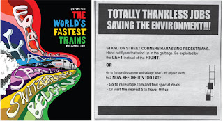
Rail Euorpe


Adnews, July 2008
Taxi

Fun advertising campaign aimed at bolstering railway travel through Europe.

Mmmm...Cheese


Coupe International Awards 2008

Clever typographic billboard from Taxi for the Canadian Dairy Farmers Association. I love that the e's seem to be laughing. When I was little and I first learned the alphabet, I would always anthropomorphise the letters. I always thought that the lowercase a and e looked like they would be the most fun to hang out with. My, was I a strange child!

Paprika


Paprika

Coupe 107, AIGA Design Annual 2008

Very white, minimal layout the better to see this design firms amazing body of work. A scrolling typographic animation is the only decorative element in this portfolio site. The site seems to have been made entirely in Flash.

Tuesday, November 04, 2008

The Young Foundation


AIGA Design Annual 2007, Pentagram

OK. Just one more from Pentagram. This is the logo for a British nonprofit that provides services for children and youth. Using a tree to symbolize growth and stability could have been trite and cliched, but the type-based treatment makes this logo seem fresh and clever.

Curious Pictures


AIGA Design Annual 2006, Pentagram

I've been spending a lot of time looking through the Pentagram website. I love the simplicity of their logos. Most of them have a timeless, deceptively effortless quality to them. Here are two wordmarks that stood out. The one above was developed for GraphicEurope, an annual design conference held in (you guessed it) Europe. Below is a logo for Curious Pictures:

Tharapy Films


Therapy Films

Coupe 107

This is a portfolio site for a commercial film studio. Navigate away from the barking monkey in the Napoleon hat and you will enter into a unique navigation experience. Very literal.