Thursday, September 28, 2006

Cronan Designs


This week I'm posting this magazine cover for Cronan Designs. I love the way this designer used color. I'm still trying to analyze the color scheme.. It doesn't seem to conform to any of the color schemes I learned about in Art 121!

Wednesday, September 20, 2006

Guy's Guide to Giving Gifts


The cover to A Guy's Guide to Giving Gifts, also designed by Dianne Gibson and featured in Graphis Design Annual 2005, uses humour to illustrate the book's content. The chord with which the book seems to be wrapped alludes to a particularly unwise choice of present for Valentines or Christmas, as does the fact that the cover mimics a brown paper package wrapping stamped with the words "Return to Sender." The credits are written on masking tape at the edgges of the book and the designer plays with our expectations of depth as we cannot tell whether the chord is two or three dimensional. An analogous color scheme of red, pink, and orange is used; while a hand-made font in the title card adds humour and whimsy to the piece.

Wednesday, September 13, 2006

The Skin Game


I found this design in Graphis International, 2005. Designed for American Airlines magazine, this image accompanied an explanation of what different plastic surgery techniques accomplish and how they work. The designer, Dianne Gibson, plays with our expectations by interposing a black and white face on top of a colored one. Illusion of depth is created by the illusion of peeled back paper on the forehead, left eye, and right half of the lips. By seeming to escape the format, the "peeled back" areas seem to project into the viewer's space. The rectangles that reveal the younger-looking colored face provide unity of shape and color. In spite of the symmetrical nature of the faces, the design is asymmetrically balanced. The two smaller horizontal rectangles on the top half of the composition are grounded by a heavier, vertical rectangle at the bottom that extends to the edge of the format. Color is balanced by the fact that the eye on the left, a strong focal point, is counteracted by two larger areas of color on the right.

Wednesday, September 06, 2006

Kikkerland Classic Card Games


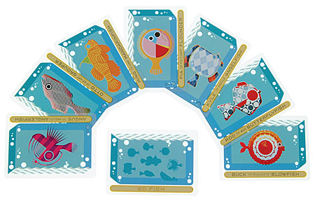
This week I am posting a design from the AIGA design archive webpage.This redesign of the classic card games Old Maid, Go Fish, and Crazy Eights for Kikkerland by Adam & Gabrielle Lewin is included in the package design category of (2005) 365:AIGA Year in Design 26. The design parameters required that the Lewins develop designs that would entertain both children and their parents while working around the added challenge of printing on clear plastic cards. They succeeded on all fronts by utilizing: bright colors in complementary or near complementary schemes and whimsical shapes to appeal to children; multilayered wit and sophisticated, highly detailed, intelligent design to appeal to the parents; and, finally, they took advantage of their medium by creating clear "peepholes" to create depth and optical illusion.

The packaging of these clear plastic card games are at once unique, visually stimulating, aesthetically pleasing, and durable. I would buy them in a hearbeat and I don't even like cards!