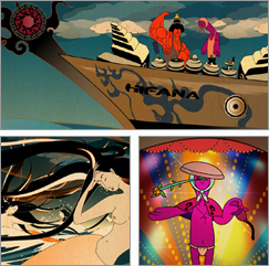
Friday, August 29, 2008

Restraint


Restraint

This font was released in 2007 by Tiroworks. It was created by Marian Bantjes, an illustrator. It is an ornamental typeface with letters included so you can build intricate ornamental design in a modular manner around the letters. Where the majority of ornamental type begins with a typeface onto which swashes and decoration are added, this one was built inside-out. The characters themselves have been defined by the negative space of the ornament, as if the letterforms are just a lucky happenstance. Ornate borders and swirly pattern based designs magically reveal themselves as words.

It looks like it requires a lot of forthought to use correctly (it comes with rather detailed instructions). This sfont should definitely be used sparingly as a display font, but in the right context it could be spectacular.

Friday, August 22, 2008

The Guardian II


After my last post, I decided to do a little bit more research on the Guardian. As it turns out, the advertising campaign was part of the newspaper's massive rebranding initiative in 2005. During this time, the Guardian switched from a black and white broadsheet to a full-color Berliner print format. They created a new all lowercase logo to reflect their unbiased, center-left reporting. Finally, they commissioned a new type system form scratch from SchwartzCo Inc. The new family is a slab-serif design with a large x-height, low contrast and open aperture that includes: Guardian Egyptian, Guardian Sans, Guardian Text Egyptian, Guardian Text Sans, and Guardian Agate. Each font comes in numerous expressive weights, and are adopted to fit the unique needs of each newspaper section.

The chief designer behind all of this was Mark Porter. If you have an hour to kill, grab a beer and pop some popocorn because here's a link to a video in which he goes through the entire process! He's a very eloquent public speaker, and the Guardian has become one of the standards for newspaper designs, so I think it's worth watching. It touches upon many of the challenges with which news designers (print and web) will be contending in the near future.


Mark Porter Video

The Guardian


The Guardian
wieden + kennedy london
Luerzer's Archive

I came across this ad campaign for the Guardian in Luerzer's Archive. I was initially attracted to the way type was used as illustration, and to the fact that the bright color palette was not one typically associated with a newspaper. It was clever and unexpected, and the serif font (probably Guardian Egyptian) remains legible in spite of the overlap and transparencies.

Here's another ad from the same campaign by Wieden + Kennedy. The same serif font and vibrant color palette is repeated. This time the copy is kerned tightly to the point of overlap to illustrate the point that you can create a hierarchy through means other than size and weight. In this case, the color palette grabs our attention and creates subtle focal points facilitate reading.

Monday, August 11, 2008

Design for Chunks


http://www.designforchunks.com/

Design for Chunks
Forcefeed Swede
Computer Arts 149

Originally an idea by graphic design studio Forcefeed Swede, I stumbled upon Design for Chunks by browsing through Forcefeed Swede's website, which was mentioned in Issue 149 of Communicaiton Arts. The site's striking color and retro illustrations are a perfect complement to the tongue-in-cheek copy and subject matter. It's purpose is to house an online gallery of custom-designed air-sickness bags designed by up-and-coming young designers. The site eventually came to the attention of Virgin Atlantic, who commissioned 20 designs and printed them on 500,000 sickbags over a period of 6 months.

The logo and illustrations look like they're right out of an '80s safety manual. Flash animation is used throughout the site minimally and to great effect. It has a simple, clear navigation system, but throws in some surprise links to keep us on our toes. The sick-bag themselves are also nothing to barf at. The ones in the archives tend to be funnier and edgier, so they are worth taking a peek at.

Friday, December 08, 2006

Convertible CD Cover

http://www.commarts.com/CA/interactive/cai04/
Package design, 2004
Sagmeister, Inc. (New York, New York)
(2005) 365: AIGA Year in Design 26

This cover is for an album by the Austrian analog/digital musician Hans Platzgummer. I love the way the designers used the inherent shape of a CD-Case to create a whimsical iconography. A minimum amount of circles is employed to create the illusion of an imaginary underwater creature; the use of primary colors enhances the simplicity of the geometric shapes.

Insects and Spiders, Oh My!

http://designarchives.aiga.org/
Illustration, 1999
U.S. Postal Service
(2000) 365: AIGA Year in Design 21

Commisioned by the US Postal Service, these series of 20 stamps are not only beautifully illustrated, but intelligently executed as well. By using artfully placed shadows and arranging the images so that they overlapped the adjoining stamps, the creepers seem to be crawling on the paper. The vibrant colors add to the sense of motion, so that the stamps are visually appealing both as a grid and as individual compositions.

Color in Motion CD-ROM

http://www.commarts.com/CA/interactive/cai04/
Interactive Annual 10: Color in Motion

In order to appreciate this MFA thesis on color, please visit the slide show posted on the Interactive Annual Website (2004). This innovative and interactive CD_ROM uses universal icons, playful animation, and fun music to illustrate properties of color and how they relate to the natural world. The designer broaches a complex subject in a clear, entertaining manner.

Chicago Chocolate Co.


http://www.commarts.com/ca/exhibit/103006/
Chicago Chocolate Co. in-store posters
Frank Dattalo, art director/designer/illustrator
Mike Roe, writer
Frank Dattalo/Mike Roe, creative directors
Marty Orzio, executive creative director
Communcation Arts Archive

Chicago agency Energy BBDO took inspiration in scientific studies that have linked women's need for chocloate with physiological causes. This humorous parody of medical illustrations
depict the reaction of a female brain when a piece of chocolate is being eaten. Great '50s-type illustration enhances the mood, as it alludes to the era's educational videos.

Alphabets Packaging


http://designarchives.aiga.org/
(2000) 365: AIGA Year in Design 21
Package Design, 1999
Lisa Billard Design (New York, New York)

Billing themselves as a “modern general store,” Alphabets houses a diverse collection of toys, books and ephemera. Playing off of Alphabets’ name, an illustrative style reminiscent of children’s “learn­to­read” flash cards represents the store’s vast range of products and its whimsical attitude. Keeping in mind the low cost of many items sold in the store, all packaging needed to be relatively inexpensive. Artwork was created that would not only not suffer by inexpensive reproduction, but would be enhanced by it.

I am Charlotte Simmons

http://designarchives.aiga.org/
(2006) 365: AIGA Year in Design 27
Book Design, 2005

This beautifully designed book echoes the innocence, strength, and beauty of Tom Wolfe's heroin. The filigree design in the background is an apt contrast to the simplicity of the curvilinear figure and sans sarif typography depicted in the foreground.

ABC


http://designarchives.aiga.org/
(2006) 365: AIGA Year in Design 27
Book Design, 2005

Hurricane Poster Project


http://designarchives.aiga.org/
(2006) 365: AIGA Year in Design 27
Promotional design and advertising, 2005
Laurie DeMartino Design Co. (Minneapolis, Minnesota)

Nestea Ice Tea Website


http://www.commarts.com/CA/interactive/cai06/
Interactive Annual 12: Nestea Ice (Winner Advertising Category)

The Nestea ICE microsite combines extremely detailed illustration with quirky viral video content, all unified by a Monty Pythonesque style of animation and sound. The attention to detail in all aspects of the project, from sound design to interactivity, seems as though it probably reflects both the fun and passion the developers must have had for the project. The more you watch, the more you're immersed.

Hifana Wamono Music Video


Comment
http://www.youtube.com/watch?v=aWHbORS_7iE
designarchives.aiga.org
(2006) 365:AIGA Year in Design 27 (56/179)

Please follow above link to fully appreciate this a celebration of Nippon culture and identity. Wamono is a music video that explores Japanese music, folklore, identity, art and technology, reinterpreting them as a contemporary hybrid expression of Japanese history. Originally made as a promotional video for the music of HIFANA (a Japanese music company), the video utilizes an ukiyo-e like style, but with unconventional and strange characters. This unusually unique pictorial world ends with a party inside a huge fish's stomach, what more could anybody want?.

Little Monsters


http://designarchives.aiga.org
(2006) 365: AIGA Year in Design. 27 (46/179)

Mocking Birdies


http://designarchives.aiga.org
(2006) 365: AIGA Year in Design. 27 (128/179)
Book Design, 2005

This deceptively simple children’s book, depicts a blue and a red bird imitating each other’s actions and “speech.” The lines are also staggered, so the colors and layout work in harmony with its jazzy meter. Eventually, the two birds join up, chirping purple lyrics, until a purple bird joins them as their songs spread this way and that across the page. Even the wires where they perch become bars of music. Annette Simon’s minimalist style makes the most of a few simple shapes and primary colors surrounded by ample white space. The way the figures appear on the page is echo the book's musicality, with their own visual rhythm.

Dry Soda Bottles


http://designarchives.aiga.org
(2006) 365: AIGA Year in Design. 27 (42/179)

Mad Science


Mad Science in the Imperial City
http://designarchives.aiga.org
(2006) 365: AIGA Year in Design. 27 (123/179)
Book Design, 2005

This is an extraordinary design for an engaging book. Mad Science in Imperial City, by Shanxing Wang, relates the experience of someone who left China after the Tiananmen Square massacre to settle in the U.S. The book is divided into four linked sections of poetic prose that draw both from the lyric and novel tradition; it utilizes scientific diagrams, mathematical equations, lists, and even a menu from an imagined Poetry Auction. All of this is integrated seamlessly by the designers, as can be seen in the jacket depicted above.

Creepcakes


Wednesday, October 04, 2006

Havainas


Here's an amazing flash-based website from Brazil. It was one of the Communication Arts' Interactive Annual winners in the advertising category. The address is www.havaianas.com.br/#

The flash animation is beautiful and inspired by a "neo-1960s-Ipanema-trippy-groovy" look. Each sandal is allocated a remixed version of one theme and six versions of the site exist in three different languages. The company manages to make its extensive catalogue fresh and interesting by creating a unique visual world that permeates the entire site. Even though each page has its own unique imagery, the site remains unified through style and the degree of saturation of its color palette.