Sunday, November 30, 2008
Maison Theater
Coupe International Awards 2007
lg2boutique
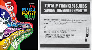
This is a fun advertising campaign from lg2boutique for the Maison Theater. It promotes a series of plays written by well-known authors for an audience of children. Bright colors and handwritten type serves the purpose well.
Saturday, November 29, 2008
JWT
JWT
Communication Arts
I read a profile of one of the art directors of for JWT in Communication Arts and decided to visit the firm's site. I like the type, the colors, the Swiss layout, and even the scrolling navigation bar. Why? Oh, Why? the flashing buttons?! Make them stop! Otherwise, I quite approve.
As an aside, I looked at their JWT Now page and read about their "Lead India Campaign " for the Times of India. I still can't make up my mind about whether it was superbly inspiring or spine-chillingly sinister. The campaign won the Grand Prix at Cannes this year. It started with the Times of India running a full page ad inciting for social change. Celebrities got involved, mass demonstrations were started (the reel doesn't make clear whether they were incited by the campaign itself or if it was a result of grassroot activism). After a long chain of events they had a reality tv competition (American idol-style where the audience got to vote through IMS) in which eight social activists competed for a sum to fund their cause, a scholarship to the JFK School of Global Leadership, and money to fund their campaign as Prime Minister of India!!!!
Prime Minsiter of INDIA!!!! Doesn't India have nuclear capabilities? Doesn't it have like triple the population of the US?! I'm all for ad agencies using their persuasive powers for activism and social change, and I understand that a certain amount of media bias is acceptbale and inevitable, but when the largest English-speaking newspaper in the world is blatantly attempting to create a world leader, shouldn't we be very frightened? VERY FRIGHTENED? Maybe I'm being paranoid. What do you think?
Wednesday, November 26, 2008
Converse
Wednesday, November 19, 2008
Commisaires
How International
Paprika
Sorry, Design Army, you have a new rival for my affections. Today I'm in loeve with PAPRIKA. This Canadian firm has been featured in every annual and magazine imaginable. Above are two pieces they created for the art gallery Commissaires.
Tuesday, November 18, 2008
Methodologie
Coupe 107
Clean, simple flash site. Crisp grid-like organiztion and solid blocks of color. The whole site seems to be designed for a small screen format (something I've noticed in quite a few portfolio sites lately). In this case it works, except I only wish the images in the portfolio section were larger. Otherwise, I wonder why make the majority of your audience suffer through micrsocopic text and image sizes now on the off chance that someone may be viewing on a smaller screen some day? Wouldn't a better alternative be to have two versions of the site?
Sid Lee
Coupe 107 and just about every other design annual out there
I love the look and feel of this design studio portfolio site. The type has that clean, blocky look that is all the rage these days. The navigation hierarchy is clear and intuitive. The fact that the subnavigaiton heading is larger than the type on the navigaiton system is a small unexpected touch which I really enjoyed. Flash and html were biht used in the construciton of this site.
Wednesday, November 12, 2008
Mmmm...Cheese
Coupe International Awards 2008
Clever typographic billboard from Taxi for the Canadian Dairy Farmers Association. I love that the e's seem to be laughing. When I was little and I first learned the alphabet, I would always anthropomorphise the letters. I always thought that the lowercase a and e looked like they would be the most fun to hang out with. My, was I a strange child!
Paprika
Tuesday, November 04, 2008
The Young Foundation
AIGA Design Annual 2007, Pentagram
OK. Just one more from Pentagram. This is the logo for a British nonprofit that provides services for children and youth. Using a tree to symbolize growth and stability could have been trite and cliched, but the type-based treatment makes this logo seem fresh and clever.
Curious Pictures
AIGA Design Annual 2006, Pentagram
I've been spending a lot of time looking through the Pentagram website. I love the simplicity of their logos. Most of them have a timeless, deceptively effortless quality to them. Here are two wordmarks that stood out. The one above was developed for GraphicEurope, an annual design conference held in (you guessed it) Europe. Below is a logo for Curious Pictures:
Tharapy Films
Wednesday, October 29, 2008
UrbanSilo
McDonald's Billboard
Luerzer's Archive, Communication Arts Interactive 13
I found this McDonald's billboard while researching Leo Burnett's ad agency (their site won a Comm Arts Interactive Award). Greenwashing? Yes. Awesome? Absolutely. They made real lettuce grow on a billboard! These are amazing times we live in.
Tuesday, October 28, 2008
AIGA, Washington DC
Design Army
These promotional materials for the DC regional chapter of the AIGA are playful, fresh, and contemporary. The first a website (It's so rare to see good typography on the internet that I had to include it) and the second is a poster.
Tuesday, October 21, 2008
AICGS
Art Director's Annual 87th Design Awards
More from Design Army. Who could possibly find fault with large, cropped letters and crisp blocks of color? Certainly not I!
Monday, October 20, 2008
Wax Partnership
Wax partnership
Coupe 017, The 2007 Coupe International Design and Image Awards Annual
This site has a fun, sketchy environment. I like the interface, its ease of use, and my son really loved the panda xeroxing his bum (go to see what we're doing). Tip: the video takes a little while to load. Warning: features people in underwear.
Wildcard Inc.
Communicaiton Arts Webpick
I don't really know what this website is about because it's in Japanese. I was checking out one of Comm Arts webpicks of the day and got mysteriously rerouted to this other site, which features 4 interfaces in which the viewer's mouse creates the a tral and illustrates the site. Very cool. Enjoy!
Design Army
Communication Arts Annual 2007, Coupe International Awards 2007
Design Army
I just killed an hour browsing through this firm's site and I'm in love! More entries will definitely ensue. I guess, though type-based, this identity package isn't a great typography find. But I like it so much i thought I'd post it anyways. I guess the font is Helvetica?
Design Army
I just killed an hour browsing through this firm's site and I'm in love! More entries will definitely ensue. I guess, though type-based, this identity package isn't a great typography find. But I like it so much i thought I'd post it anyways. I guess the font is Helvetica?
Wednesday, October 15, 2008
HOAX REVEALED!
Thanks to Miriam's forensic typography I don't need to do a big reveal this week. The Economist cover I posted last week was, obviously, a hoax. The real cover is posted above. Last week's version has been floating around the blogosphere for a while, so I no longer remember where I originally saw it.
The Economist has a long history of typographic ads and covers, though. For decades they had humorous quotes in a white serif Bodoni or Bodini-like font. Here are a couple examples:
Their most recent ads build on this tradition and incorporate illustration elements. Here's an example:
Tuesday, October 07, 2008
Monday, September 29, 2008
Marck Ecko
Marc Ecko
Computer Arts magazine
This site has so many good ideas, I wish it had kept a couple of them to itself. The site has a consistent look and navigation system, but the flash is sometimes overwheming.
ABC3D
ABC3D
I found this link on Cosas Visuales, a Spanish design blog. It features a pop-up book that takes on the alphabet as a sculptural challenge. Very clever. Very cool. Very catchy tune.
Monday, September 22, 2008
Dwight McKnight: Unregistered Trademark
Dwight McKnight
AIGA website
I thought it would be interesting to see what other recent graduates are doing in the area of web design, so I checked out this featured designer in the AIGA website. I think this is a simple, unique take on the portfolio page, both simple in concept and technology. He tiles a background images to create a visually arresting wallpaper of his work. The effect fills the screen regardless of size, and is quite unexpected. The text inside the navigaiton bar could maybe use a little rethinking, but otherwise I give this a thumbs up.
Gymboree
This logo was created by Michael Osborne Design. The firm was mentioned in Computer Arts magazine a couple of months ago. I tried to identify the font for GYMBORee, first by typing the words out in different fonts, and then by taking it to What the Font. Neither worked, which is not surprising, because my guess is that this was custom-made for the logo. The G, Y, M, and the B all look like a squashed slightly more angular version of Gill Sans, while the rest of the letters seem like squashed Helvetica. Answer: My believe is that this is the long lost child of the two-- Gillvetica Anorexica. No? I challenge you to make a better guess! Bottom line. I think the wordmark is fun and energetic, but it achieves its quirkiness with subtle variation in type and case rather than over-the-top imagery. This is refreshing in a children's brand.
THIS JUST IN: I believe Bureau Grotesque one three comes pretty close to the logo type. See for yourselves.
Wednesday, September 17, 2008
Grawlix: Word of the Week
Ever wonder what those strings of non-alphabet characters used to indicate swear words are called? Jonathan Hoefler explains:
grawlix, n. A string of typographical symbols used (especially in comic strips) to represent an obscenity or swear word.
Apparently the term was coined in 1964 by Mort Walker, but is still waiting to be recognized by the Oxford English Dictionary. What's taking them so @!$&^$* long?! Apparently the term is not used widely enough, so we'll just have to contribute to the effort. So, do you have a favorite set of grawlix characters? Do you prefer to grawl in a particular type?
New Xerox Logo: What the Grawlix?
This is not an example of outstanding design. I stumbled upon xerox's new logo and was quite puzzled. While I think the new treatment of the wordmark is actually an improvement and quite lovely, I just don't understand that big red marble sitting beside it. Far from adding meaning or harmony it detracts from the cleanliness of the type and throws the entire composition off-blance.
So, I decided to find out a little more about the logo, and lo and behold, I came across this article in underconsideration.com. They were not complimentary, either.
The design firm responsible for this new logo is Interbrand, and apparently they chose to incorporate a symbol in order to better animate the logo. In their own words:
The new Xerox logo is now a lowercase treatment of the Xerox name — in a vibrant red — alongside a sphere-shaped symbol sketched with lines that link to form an illustrative "X," representing Xerox's connections to its customers, partners, industry and innovation, and designed to be more effectively animated for use in multi-media platforms.
— Official press releaseSignaling a clear change and evoking a dramatic shift in the world's perception of this iconic brand, the visual and verbal identity system for Xerox has undergone a massive redesign. The new signature incorporates a lowercase treatment of the Xerox name — in a vivid red Pantone 1797 — alongside a sphere sketched with lines, called "connectors," that link to form an "X", representing the company's connections to its customers, employees, partners, industry and innovation. The "connectors" are super-graphics that appear as reoccurring design elements.
— Interbrand project description
Here's the much talked-about animation. Wipee! If you didn't click on the link, don't bother. The logo recedes, glints, and has a shadow. In the words of Michael Beirut, who commented on the article (it's no lie, apparently he reads the blog at 1am in the morning):
Michael Bierut’s comment is:
I wish I were dead.
On Jan.08.2008 at 01:10 AM
Bad Gift Emporium
www.badgiftemporium.com
Do you have a horrible, horrible gift? Would you like to acquire someone's horrible, horrible gift? Maybe you just want to have a good laugh? Here's another site by Barclay (they designed the March of Dimes website) to help you out. The tackiness and uniqueness of the interface goes well with the quirkiness of the content. This site is mostly designed in Flash and navigation is slow, but it's a fun way to kill a half hour. You never know, someone's white elephant could be dream come true.
Thursday, September 11, 2008
Re-Re-Re-Recycler
EnBw Spamrecycler
Communication Arts Interactive 13
Credits:
Paul Fleig/Stefan Walz, creative directors
Paul Fleig, writer
Joerg DiTerlizzi/Marko Ritter, programmers
Fabian Buergy, graphic designer
Fabian Roser, 3-D designer
Christine Seelig, project manager
Jung von Matt, project design and development/client
Don't know what to do with all the junk in your spam folder? Why, recycle it, of course! Send your spam to the EnBw Spamercycler. The site uses Flash 8 programming with PHP scripts (or binary voodoo, as i like to call it), and voila. Instant art. The design team has this to say about the process:
The algorithms of the Recycler are taken from collider experiments in modern physics and a new render engine which creates JPEGs out of Flash (this one ticked-us-off for weeks). The process breaks-down the spam mail into its very particles and accelerates them. Every particle leaves a characteristic trace depending on its individual kinetic energy.
Like I said, binary voodoo. In case you were wondering, here's how my turned out:
Sunday, September 07, 2008
Pain is Good 'Zine
Pain is Good Magazine
Client: Original Juan
Design Firm: Barkley
Source: Communication Arts Annual Interactive 14
This is the cover and contents page for a 'zine used to advertize hot sauces. I love the campy, retro feel and the hand-drawn type radiating from the product. It makes me want to read the 'zine and I don't much care for hot sauce!
March of Dimes
MARCH OF DIMES: Wonder Site
Design Firm:Barkley
Source: Communication Arts 14
Aww...The baby sucks its toooooes! A flash animation video of different babies appears behind hundreds of searchable questions. You can click on the links or search for a specific question. The answers appear in a new window in a clean, much more conventionally designed layout. Overall, it is a creative concept and navigation system, but it takes way too long to load on my computer.
Saturday, August 30, 2008
Jonathan Yuen
Jonathan Yuen Portfolio Website
Communication Arts 13
This lyrical portfolio site seems to be made entirely with Flash. The result is a fluid, lyrical digital interpretation of a zen scroll. When you hover your mouse over the minute red circle beside each Chinese character, the screen scrolls over to the next animation. This is a perfect example of how an unconventional navigation system can be simultaneously innovative, intuitive, and beautiful.
And Then There Were Two...
In this day and age when branding is ubiquitous, you'd think that our presidential candidates would put a little more thought into how they package their image into a logo. Every nuance, line, and joke that issues forth from their mouths is subject to endless analysis from the media, but the graphics they choose as visual shorthand for whom they are seldom get any scrutiny. The two notable exceptions are the remaining candidates. I think Obama has the best presidential logo I have ever seen. The round, geometric O depicts a sunrise against a blue sky. The stripes evoke a landscape that leads off into a hopeful tomorrow. It is sunny, contemporary, and hopeful, while the clean, well-kerned serif font beneath (Gotham) is more traditional and inspires confidence with its mixture of upper nd lower case caps.
John McCain, on the other hand, chose Optima for his logo. The typeface is blunt, ugly, and to the point, much like the persona he projects. It is no cincidence that the font used is the one in which names are written at the Vietnam Memorial. This, plus the naval star remind us of his military experience.
Friday, August 29, 2008
Visual Complexity
Visual Complexity
This is the only website I've found so far mentioned in a design publication that seems to make no use of Flash. It doesn't need it. The grid structures, easy to follow architecture, and clear navigation system are perfect for viewing these beautiful images.
Picardie
JLern Design
http://www.jlern.com/
Communication Arts Interactive Annual 14
This portfolio site uses Flash in a way that is unique and fresh. Upon first entering the home page we see a sparse, black and white typographic grid placed on a diagonal. As you move the mouse, however, you change the direction of the grid and trigger brightly colored ornamental animation. Clicking on features zooms in and out of the image.
Subscribe to:
Posts (Atom)