Thursday, May 07, 2009
Monday, March 02, 2009
Nando Costa

http://nervo.tv/index.html?sect=5&proj=pgi
This designer was featured in Computer Arts Magazine sometime last year. He's one of the hottest animation designers around. Enjoy!
Friday, February 27, 2009
Orange Design Self-Promotion
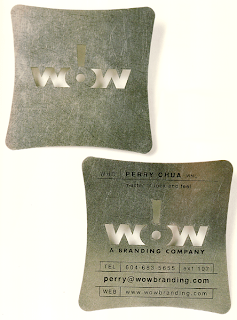
WOW Business Card
 This is a business card created for WOW! Branding Company. It was featured in the Art of Promotion by Laura Cyr. As I've mentioned before, I am currently in the process of designing my own promotional materials. I looked into using alternative materials (like plastics, metals, cloth, die cuts, metallic inks) and the cost is astronomical, specially when you compare it to online printers like VistaPrint or Overnight Printing. I really wonder how much of a payoff there is to going through the expense of creating something like this. It looks amazing, it probably won't get thrown away, but will it generate enough revenue to offset the expense? What do you guys think?
Holiday Card
Architectural Business Cards and Invitations
Wednesday, February 25, 2009
TurnStyle Identity Package

Communication Arts Design Annual 49
This is a beautiful identity package created by TurnStyle Design. I like that the entire design is built around a play on words on the title. The embossing on the letterhead adds an unexpected element of subtlety, aptly used in this case because I think that a solid block of orange might have been too distracting in a letter. The landscape orientation is unique, but I'm not sure that it would be quite functional as the space left for the letter seems too wide for a single column layout, but too narrow for multiple columns.
Barbara Lipp Bubble Gum
 Here's another gem from the Art of Promotion from Lisa Cyr. This illustrator and package designer decided to showcase her talents by creating custom-wrapped bubble gum to leave behind with potential employers. Her quirky illustrations are also featured throughout the rest of her identity package, creating a colorful, whimsical, unified system.
Sunday, February 22, 2009
Signature Theater
Thursday, February 19, 2009
One Watch Catalog

Communication Arts Design Annual 49
The makers of this beautifully designed watch catalog decided to print the products on clear, plastic pages. This allows the consumer to "try on" as many watches as they please without leaving the comfort of their home. Apparently sales tripled after the company introduced this system. So, when form follows function agood time is had by all
Tuesday, February 17, 2009
Innovative Portfolio

I've been doing a lot of research lately on self-promotion packages. In so doing, this innovative leave-behind portfolio design caught my eye. The book features slits throughout the page, allowing for a modular approach to organizing the content of the portfolio. This allows the designer to present a professionally bound book to the client, but allows for flexibility in the material displayed. It's from the Art of Promotion, by Lisa Cyr.
Subscribe to:
Comments (Atom)


